
2025 Roundup:
Black Friday Email Design
My inbox is full of Black Friday email junk. So many brands, so many emails, so many missed opportunities.
I’ve curated a cross-industry suite of seven that hit the mark to help you to make needle-moving tweaks.
Promotional email design needs to strike a sweet spot:
👉 Unmistakable clarity (what, when, where)
👉 A reason to care (a spark of inspiration that connects the reader to your brand or product)
It sounds simple, right? Most emails I've seen during BFCM (that’s Black Friday, Cyber Monday) so far are 'overdone': over explaining, over designed.
A 2025 study found that users spend less than 9 seconds digesting marketing emails.
So ticking both of these simple points will help you rise above the chaos.
Let’s get into it:
Intimissi
My score: 6/10
It ticks the box of being incredibly simple and ‘well designed’, but misses some fundamentals such as when the event ends.
✅ Concise main message at the top in live text (great for screen readers).
✅ No-fuss, engaging GIF. Background offers a simple play on product (tights).
✅ Clear, concise email copy = great for scan-ability.
✅ 6 x best-selling product with clear was/now pricing. Acts as great case studies, plus easy access to shop = chance of higher CTR.
❌ Image is too tall, pushing CTA out of view and relying on users to scroll.
❌ CTA destination is unclear (Buy Now), and category-level links are a missed opportunity.
My score: 8/10
Does a wonderfully playful job of creating a genuinely engaging brand experience; very important for higher-priced brands whose customers aren’t typically motivated by just price.
Tiny Cottons
✅ Playful and engaging GIF that leads with Black Friday to make the email’s purpose clear.
✅ Great at specifying what, when, where.
✅ Clear signposting to the two biggest categories.
✅ 6 x best-selling product with clear was/now pricing. Acts as great case studies, plus easy access to shop = chance of higher CTR.
❌ Full width CTA looks like a banner rather than a button and could easily be overlooked.
❌ Missed opportunity for value proposition (eg. extended returns policy).
My score: 9/10 (🌟 my favourite)
Simple, striking design choices create a cohesive campaign across all communications (red ‘floating’ product, black and white photography).
Thoughtful signposting creates a frictionless way to browse.
Altitude Sports
✅ Simple, impactful hero image with clear core category CTAs.
✅ Clear communication of discount messaging at top of the email, without distressing the product or brand tone of voice.
✅ Categories of five different ways to shop eg. ‘Everything under $100’, ‘5-star items on sale’.
✅ 4 x best-selling product with clear was/now pricing. Acts as great case studies, plus easy access to shop = chance of higher CTR.
✅ Clear banner for extended returns policy.
❌ ‘All the best deals’ full width CTA looks like a banner rather than a button and could easily be overlooked.
❌ Missed opportunity for GIF to show product breadth in hero whilst keeping its simple, impactful layout.
Make Time
My score: 5/10
Beautiful imagery and colours but missed the mark on hyping up the promotion.
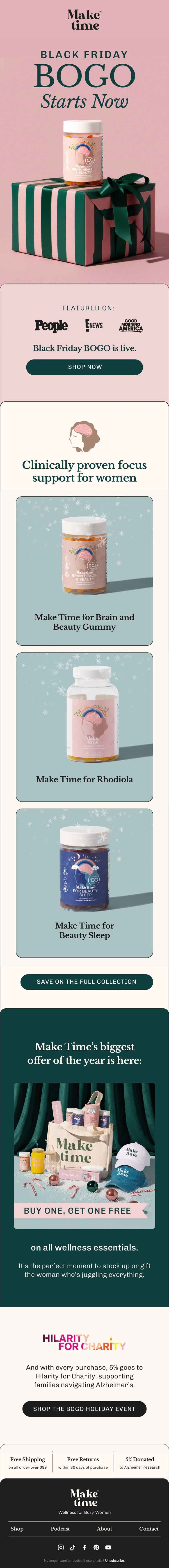
✅ Press logos increase trust and credibility.
✅ Beautiful photography builds on brand perception.
❌ Missed opportunity to add was/now pricing to products.
❌ Too long and narrow for a promo launch email; wide category offering would make more sense.
❌ Not all customers will know what BOGO is. Unclear at a glance what the promotion is.
Tom Dixon
My score: 7/10
Simple yet striking visual campaign that can work across many channels.
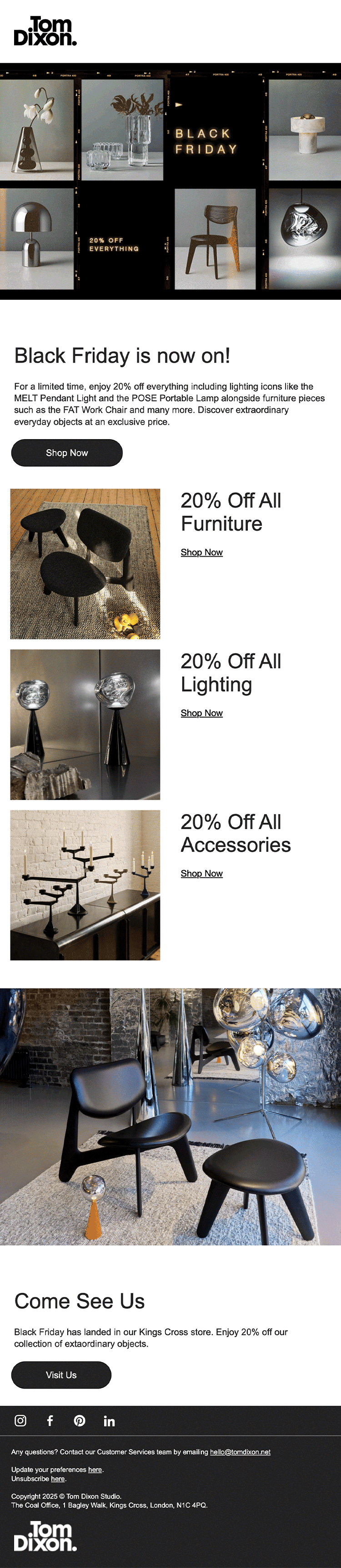
✅ GIF creates engagement, consolidating ‘distressed’ messaging and creating space for brand and product.
✅ Beautiful photography showing variety within a category.
✅ Concise, live text = great for screen readers.
✅ Clear category links.
✅ Understanding their high-end customer base and the potential importance of viewing in person (‘Come See Us’).
❌ Missed opportunity to reiterate campaign aesthetic further down the email to build recognition.
❌ Missed opportunity for value proposition (eg. extended returns policy).
Kenay
My score: 6/10
Effectively balances promo messaging with an elevated brand experience.
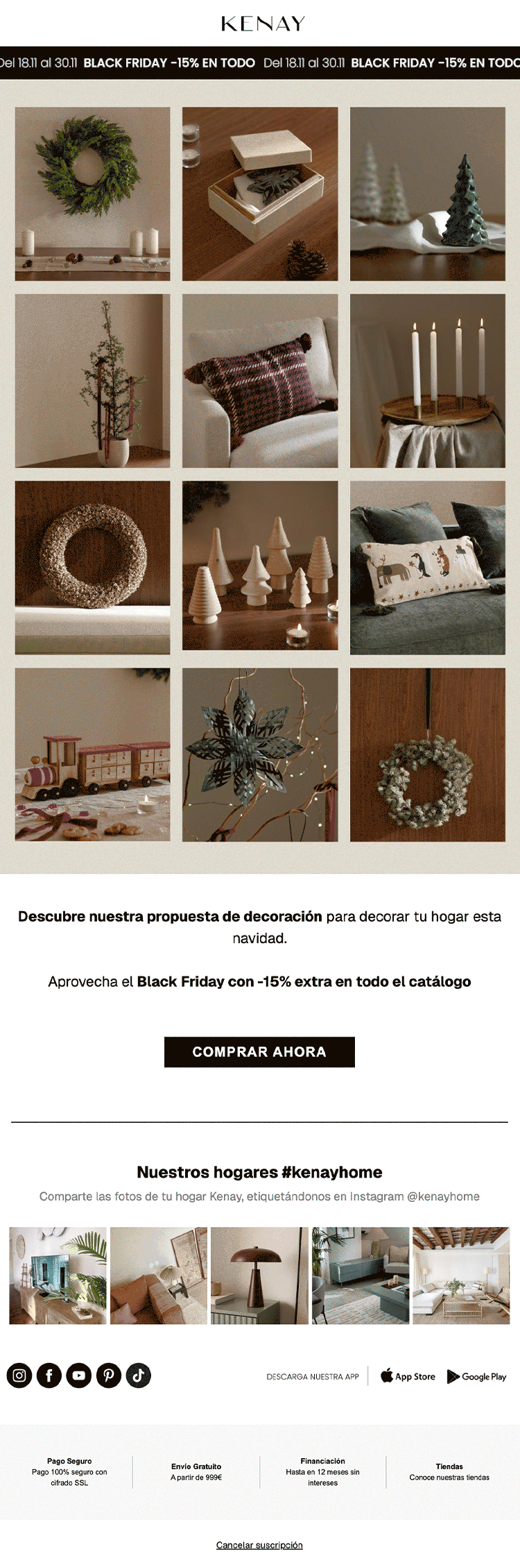
✅ GIF creates engagement, consolidating ‘distressed’ messaging and creating space for brand and product.
✅ Beautiful photography showing variety within a category.
✅ Concise, live text = great for screen readers.
✅ Social proof banner builds trust.
❌ CTA destination is unclear (Comprar Ahora = Buy Now), and category-level links are a missed opportunity.
❌ No header or title = less scan-able, users may miss the core message.
❌ Hero image is a single link, rather than product-level links, creating unnecessary friction.

My score: 7/10
Technically not a Black Friday campaign, but deserves a special mention: a thoughtful update to the Welcome Flows to avoid promotion conflict and confusion.
Mammut
✅ Neon yellow separates core email with promotional content.
✅ Dynamic, striking photography gains attention.
✅ Selling in Early Access as part of a Welcome series is a great way to demonstrate mailing list benefits.
✅ Does a great job of what, when, how.
❌ Promotion end date is missing.
❌ Nested image could have made it even clearer that this image is associated with something important beneath (encouraging users to scroll).
❌ Styling conflict between code and the CTA that follows.

Email Design
Did you know that, typically, email is the highest converting traffic source?
I design emails for both service-driven clients and ecommerce clients, whether marketing emails or strategic flows.